How to build a dashboard in Azure Cloud using App Insights queries with KQL generated by LLM
- Fernando Souto
- Dashboard
- December 22, 2024
Table of Contents
Building a robust and insightful dashboard in Azure Application Insights with KQL (Kusto Query Language) allows teams to monitor and analyze their application’s performance and user behavior. This guide will walk you through creating such a dashboard with examples of key performance indicators (KPIs) and corresponding charts. I don´t know nothing about KQL but I will use an LLM to generate the queries I need.
Why use App Insights and KQL?
Azure Application Insights is a powerful tool for tracking the health, usage, and performance of your applications. Combined with KQL, it provides unparalleled flexibility for querying and visualizing data. By the end of this guide, you’ll have a clear, actionable dashboard featuring metrics like the number of users, messages, and active vs. inactive users.
Setting up your dashboard
Access application insights: Navigate to your Application Insights resource in the Azure portal.
Open the Logs (Analytics) tool: This is where you’ll write your KQL queries.
Create metrics and visualizations: Write queries for KPIs, then save them as parts of a shared workbook or dashboard.
Sending user_Id to App Insights
To track user-specific metrics like unique users or top users by activity, you need to ensure user_Id is sent to Application Insights. Here’s how you can do it:
Set Up telemetry in your application:
For applications using the Application Insights SDK, enrich your telemetry data by setting the user_Id context.
Example for .NET:
var telemetryClient = new TelemetryClient();
telemetryClient.Context.User.Id = "user123";
telemetryClient.TrackTrace("Sample trace with user ID");
Example for JavaScript:
appInsights.setAuthenticatedUserContext("user123");
appInsights.trackTrace({ message: "Sample trace with user ID" });
Verify the Data:
Check your traces in Application Insights to confirm that user_Id is being logged.
Modify Your KQL Queries:
Once user_Id is available in traces, you can use it in your queries to analyze user-specific data.
Top KPIs to include in your dashboard
Total users
This metric gives you the count of unique users interacting with your application.
Query:
traces
| where timestamp >= startofday(now() - 30d)
| summarize TotalUsers = dcount(user_Id)
Chart: Display as a single number or in a column chart showing trends over time.
Total messages
The total number of messages sent in your application.
Query:
traces
| where timestamp >= startofday(now() - 30d)
| summarize TotalMessages = count()
Chart: Single number for total count or a time chart to display trends.
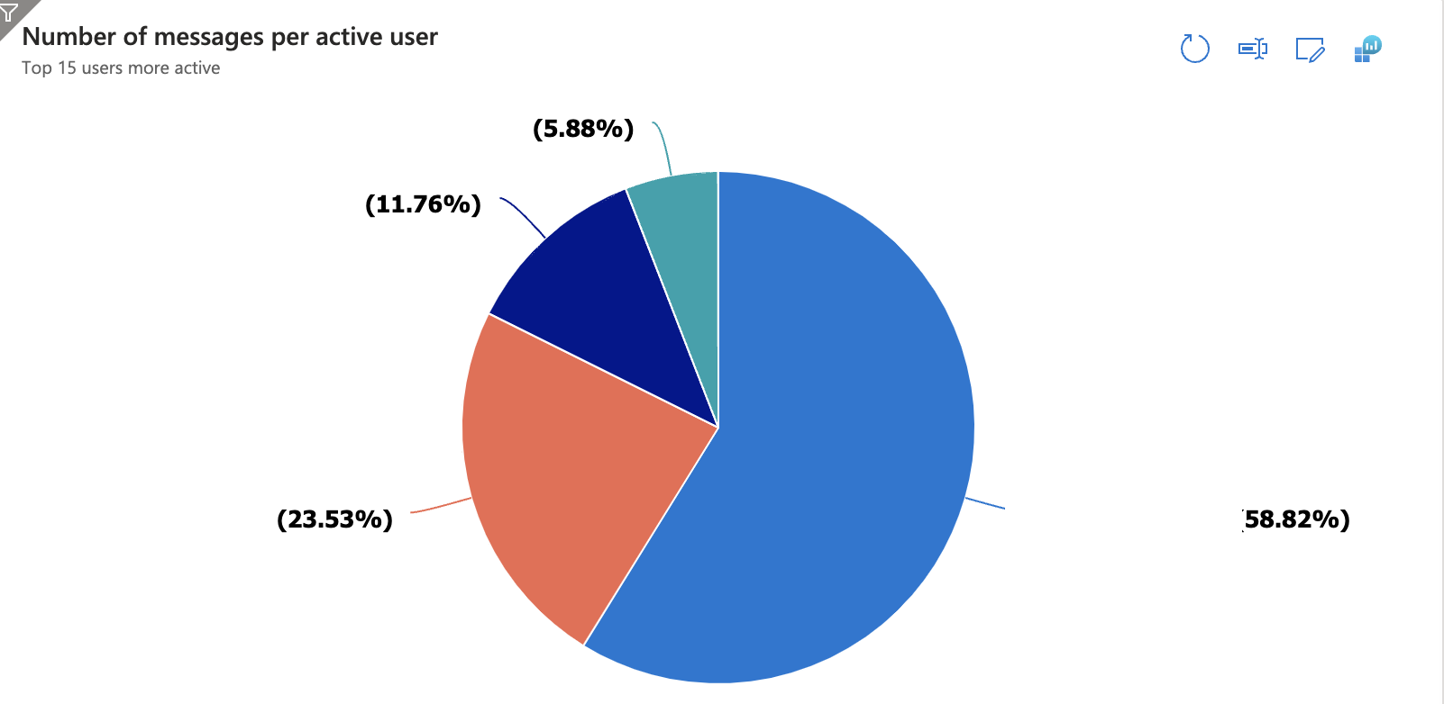
Top users by message count
Identify the most active users by the number of messages they sent.
Query:
traces
| where timestamp >= startofday(now() - 30d)
| summarize MessageCount = count() by user_Id
| top 10 by MessageCount desc
Chart: Bar chart showing the top 10 users and their message counts.
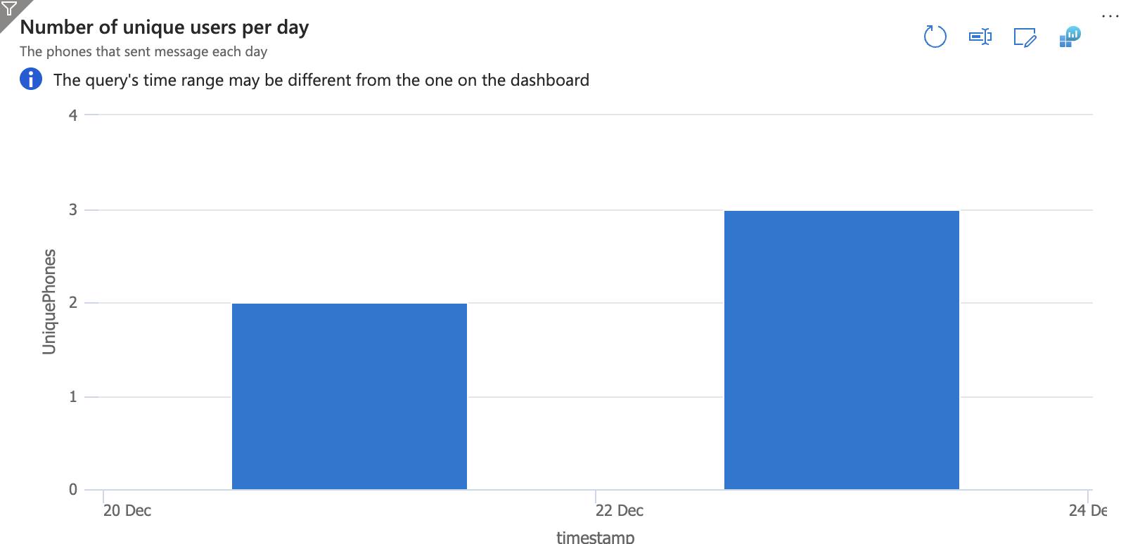
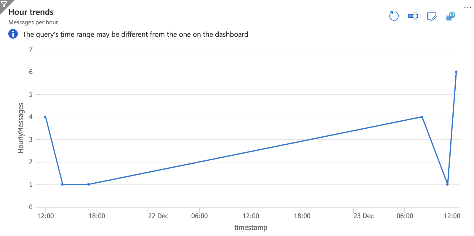
Messages per day
Track the volume of messages sent daily to identify usage trends.
Query:
traces
| where timestamp >= startofday(now() - 30d)
| summarize DailyMessages = count() by bin(timestamp, 1d)
Chart: Line or column chart to show daily activity.
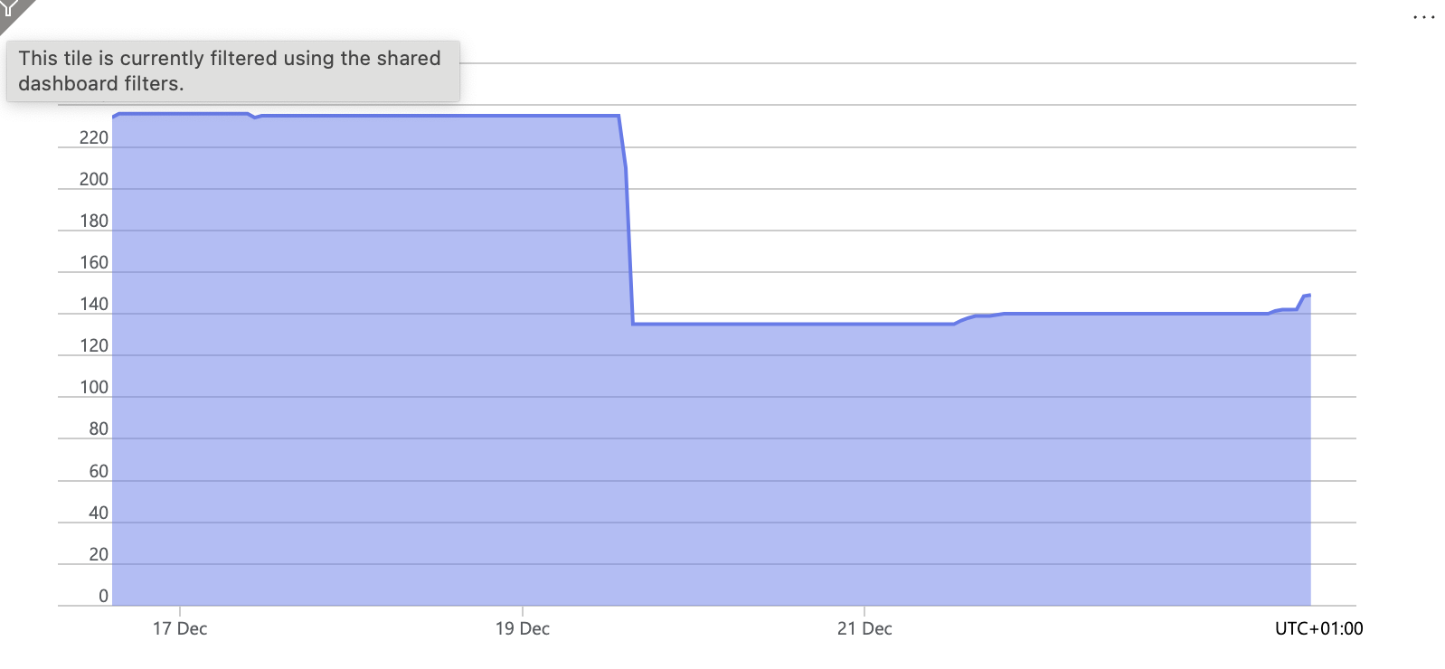
Active vs. Inactive users
Analyze user engagement by categorizing users as active (sent at least one message) or inactive.
Query:
let ActiveUsers = traces
    | where timestamp >= startofday(now() - 30d)
    | summarize ActiveUserCount = dcount(user_Id);
let TotalUsers = traces
    | summarize TotalUserCount = dcount(user_Id);
union (ActiveUsers | extend Category = 'Active')
     (TotalUsers | extend Category = 'Inactive', Count = TotalUserCount - ActiveUserCount)
Chart: Pie chart showing the proportion of active vs. inactive users.
Building the dashboard
Add queries to workbook: Save each query as a separate tile in an Application Insights Workbook.
Customize visualizations: Adjust chart types and layouts to make the dashboard intuitive.
Set alerts: Configure alerts based on thresholds for any KPI, such as a sudden drop in active users.
Sample dashboard output
Below are examples of charts generated using the queries:
Daily messages (Bar chart)
Top users by message Count (Pie chart)
Message trend over time (Time series)
User trend over time (Area chart)
Lessons learned
Use LLM to generate queries: Automate the creation of the queries by using an LLM. The LLM is pretty good creating those queries for your.
Data cleaning: Ensure your logs contain clean and consistent data to avoid misinterpretation.
Efficiency: Use summarization functions like summarize and dcount to optimize queries.
User engagement: Monitoring active vs. inactive users is crucial for retention strategies.
Visualization: Select chart types carefully to maximize clarity and impact.
Automation: Automate the refresh of your dashboard to always reflect the latest data.
Conclusion
Building a dashboard with Azure Application Insights and KQL empowers teams with actionable insights. By focusing on relevant KPIs like user activity and message trends, you can better understand your application’s performance and user behavior. Incorporating lessons learned ensures your dashboard is both effective and sustainable.
Use the LLM to generate the KQL queries and start creating your own dashboard today and unlock potential of your application data!